> ## Documentation Index
> Fetch the complete documentation index at: https://docs.pulseairtest.com/llms.txt
> Use this file to discover all available pages before exploring further.
# Pressure charts
The charts presented on both the Pulse controller and Pulse Online are a visual representation of the Pulse test cycle and data recorded.
They allow you to see the measurements you've collected, assess test quality, and do basic checks that the equipment is working as expected.
## Air flow chart
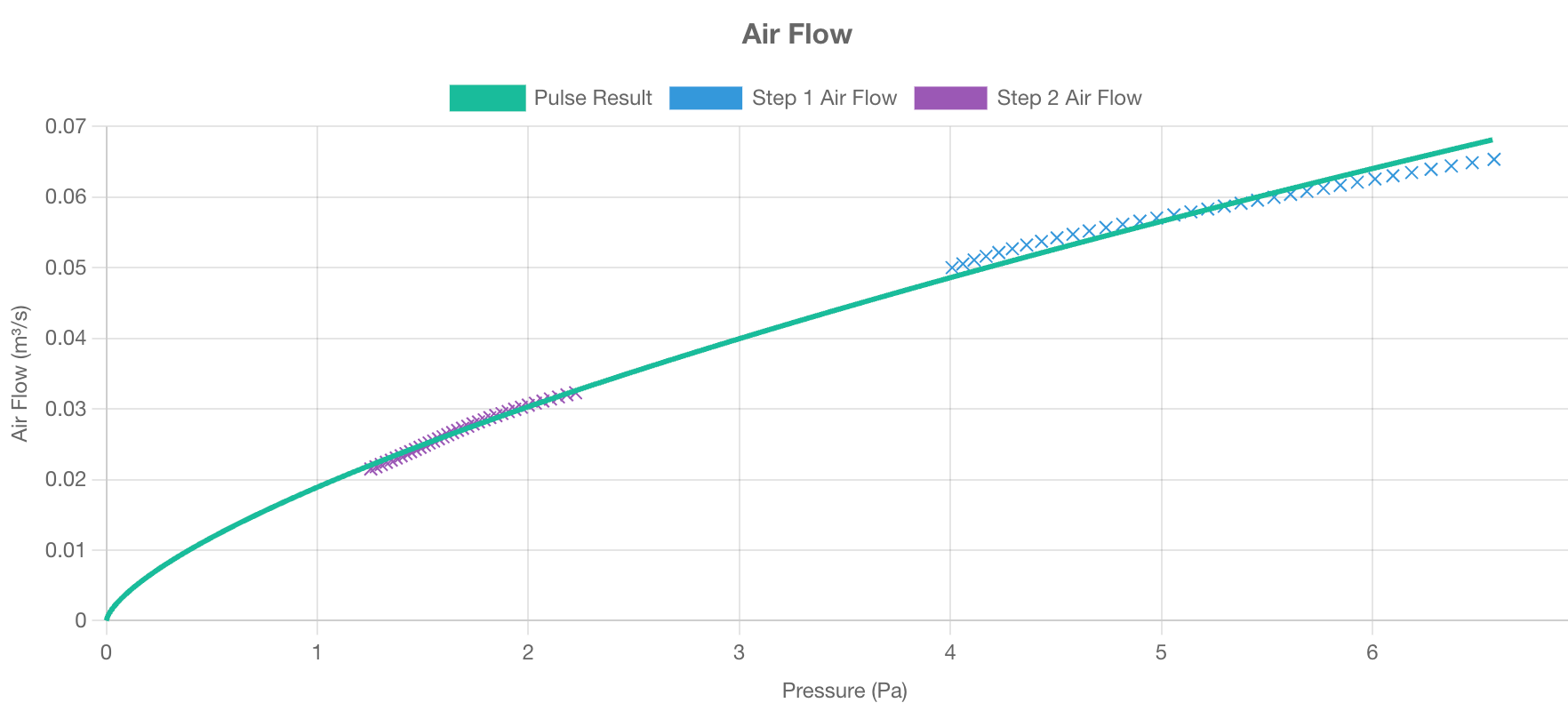
The air flow chart displays the relationship between the pressure in the enclosure (x-axis) and air flow into the enclosure (y-axis).
 Key points:
* A good test produces data points closely clustered around the line of best fit, demonstrating consistent airflow measurements.
* Ideally, data points should span pressures both above and below 4 Pa. If the achieved pressures is consistently higher than 4 Pa, fewer air receivers or a lower charge pressure may be sufficient. If the achieved pressure is always lower than 4 Pa, additional air receivers or a higher charge pressure may be needed to adequately pressurise the enclosure.
* The data points are recorded at an interval of 50 Hz, so even short tests generate a dense set of data points, improving the reliability of the curve fit.
* Outliers or scattered data points may indicate transient disturbances or measurement issues.
## Air pressure chart
The air pressure chart plots building/room pressure (y-axis) over time (x-axis). This visualises the burst of air being released into the space and the subsequent pressure decay.
Key points:
* A good test produces data points closely clustered around the line of best fit, demonstrating consistent airflow measurements.
* Ideally, data points should span pressures both above and below 4 Pa. If the achieved pressures is consistently higher than 4 Pa, fewer air receivers or a lower charge pressure may be sufficient. If the achieved pressure is always lower than 4 Pa, additional air receivers or a higher charge pressure may be needed to adequately pressurise the enclosure.
* The data points are recorded at an interval of 50 Hz, so even short tests generate a dense set of data points, improving the reliability of the curve fit.
* Outliers or scattered data points may indicate transient disturbances or measurement issues.
## Air pressure chart
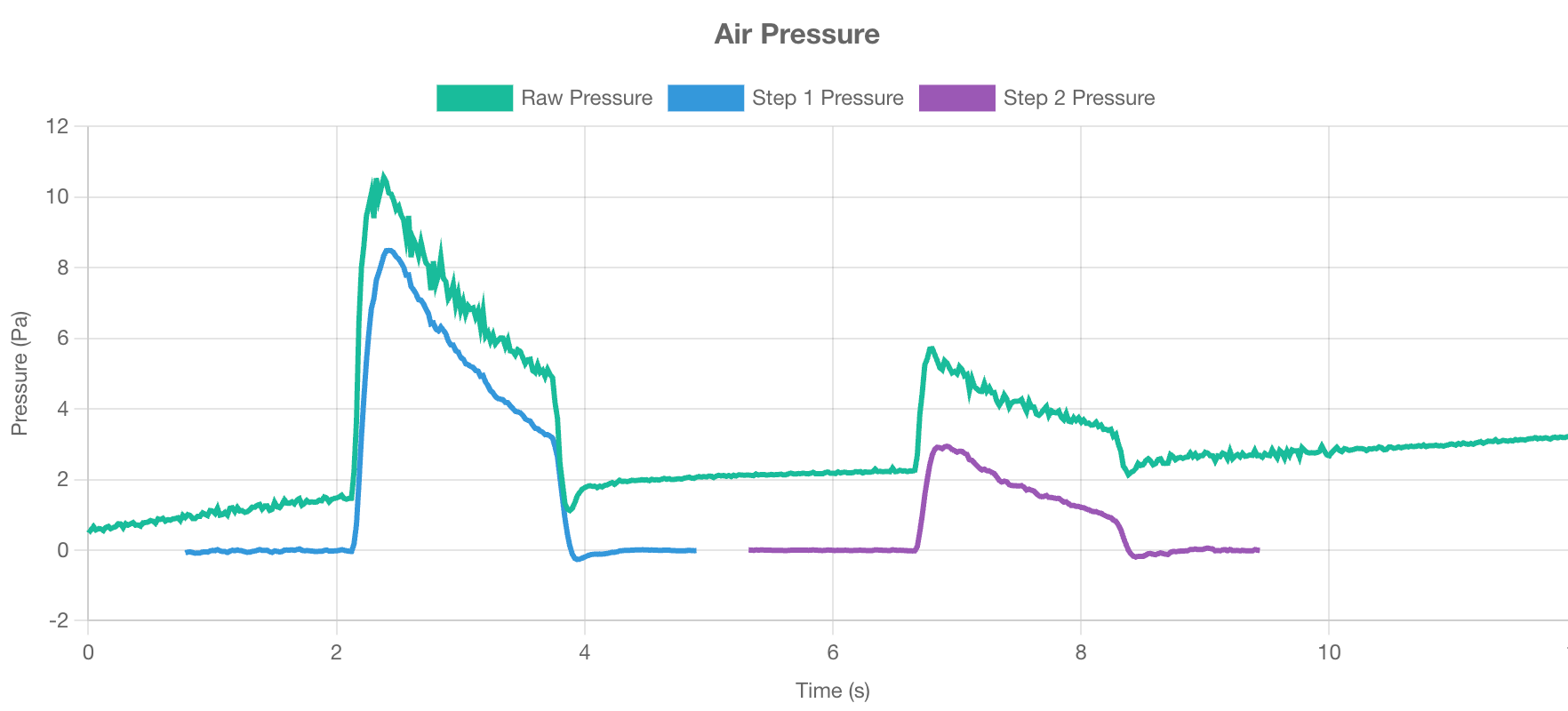
The air pressure chart plots building/room pressure (y-axis) over time (x-axis). This visualises the burst of air being released into the space and the subsequent pressure decay.
 Key points:
* Look for a clear peak after the air has been released, followed by a smooth decay back toward ambient pressure.
* A clean downwards curve indicates a stable escape of air from the test enclosure.
* Minor fluctuations near ambient pressure are normal, but large variations could suggest environmental interference (e.g. high or gusty wind speed) or occupant movement.
## Air receiver tank pressure chart
The air receiver tank chart displays the pressure within the air receivers during the test.
Key points:
* Look for a clear peak after the air has been released, followed by a smooth decay back toward ambient pressure.
* A clean downwards curve indicates a stable escape of air from the test enclosure.
* Minor fluctuations near ambient pressure are normal, but large variations could suggest environmental interference (e.g. high or gusty wind speed) or occupant movement.
## Air receiver tank pressure chart
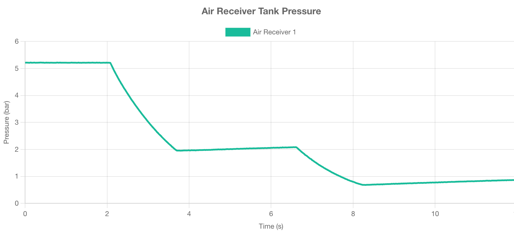
The air receiver tank chart displays the pressure within the air receivers during the test.
 Key points:
* Tank pressure should be steady before and after each step and decrease steadily during the step, confirming that air is being released correctly.
* Sudden drops or no drops may indicate equipment issues.
* Minor increases in pressure after a step are due to temperature changes within the tank.
Key points:
* Tank pressure should be steady before and after each step and decrease steadily during the step, confirming that air is being released correctly.
* Sudden drops or no drops may indicate equipment issues.
* Minor increases in pressure after a step are due to temperature changes within the tank.